E-commerce app that allows users to purchase gaming equipment
May 2025 - Jul 2025
Research documentation, usability study plan / interview script, wireframes, prototypes
Gamers often face an overwhelming experience when shopping for accessories online. Many sites and apps prioritize aesthetics or product volume over usability, making it difficult for users to find gear that fits their play style, technical needs, budget, or accessibility requirements.
Design an eCommerce experience that helps gamers of all abilities efficiently discover, evaluate, and purchase gaming accessories. The product will support personalized filtering, accessibility-focused browsing, and curated bundles—making the process easier, faster, and more inclusive for casual and competitive gamers alike.
Sole UX Designer
This project began with a prompt rather than an existing business, which is as follows: Design an app that enable gamers to purchase gaming equipment.
After establishing the business, I needed to determine my target audience. With the help of AI, I generated key details and demographics. To summarize:
For more details on the target audience, see the target audience document.
Considering this business did not already have any set product in mind, I created some mock interviews to determine what the app's focus should be and what user needs are. The question is: how can I make this app stand out?
Interview goals:
I did not have the resources to conduct real interviews, so I generated a sample interview transcript to help me complete my objective.
Using a template, I filled out information that included basic demographics as well as goals and pain points. You may view specific details in the personas and user journeys sections below.
By reflecting on my findings in crafting user stories, I then identified possible solutions to specific user problems and created a value proposition list (document) that may solve those problems.
At this point I created a goal statement that would help narrow down my focus for the app.
Goal statement: Our app will let users easily find and purchase gaming equipment which will affect their ability to shop quickly and condifently by offering curated bundles, aesthetic-based browsing, advanced performance filters, and accessible shopping features. We will measure effectiveness by the number of positive reviews, engagement, and purchases.
I performed a competitor audit to see what is already out there, and to get some inspiration. I also put together a competitive audit report to make the content of the audit a little more digestible.
For information on the design process, please view the design section.

"If my gear can't keep up with me, it's holding me back."
Derrick is a full-time streamer and FPS competitor with a high-performance mindset. He invests heavily in his gear and values customization, speed, and reliability. He often reviews new equipment on stream and influences his audience's buying decisions.
As a professional gamer and streamer I want to filter accessories by performance specs and preview customization options so that I can quickly find high-performance gear that enhances both my gameplay and my stream’s aesthetic.

“I just want something that works for both work and gaming — and looks good doing it.”
Michelle plays cozy and story-based games to unwind after work. She prefers gear that’s minimal, multi-functional, and reasonably priced. She’s not super techy, so a clean, guided shopping experience is important to her.
As a casual gamer and remote worker I want to find quiet, stylish accessories that work for both gaming and work, and view curated bundles so that I can avoid decision fatigue and keep my setup functional and affordable.

“I’ll keep gaming as long as I can click a mouse — I just need the right tools.”
Harold is a long-time PC gamer who enjoys mental challenges and immersive simulations. As he ages, he needs more ergonomic, adaptive tools but doesn’t want to sacrifice quality or autonomy in the shopping process.
As a senior gamer with arthritis I want to filter for ergonomic and accessible products so that I can continue gaming comfortably without having to rely on others to help me find compatible gear.

“My gear is part of my identity — it should reflect my style and support my setup.”
Emery is a creative who blends gaming, art, and streaming. They prioritize form and function equally and seek gear that enhances both performance and personality. Community reviews and design are major influences.
As a creative gamer and part-time streamer I want to browse by visual style and easily see setup compatibility so that I can build a cohesive setup that expresses my identity and works seamlessly with my streaming tools.
.drawio.svg)
After my initial user and competitor research, I sketched some general ideas of what could work for a few different screens.
I thought some sort of banner layout would be the way to go for the homepage, but I eventually decided against it because it was too condensed/ I wanted to feature specific categories.
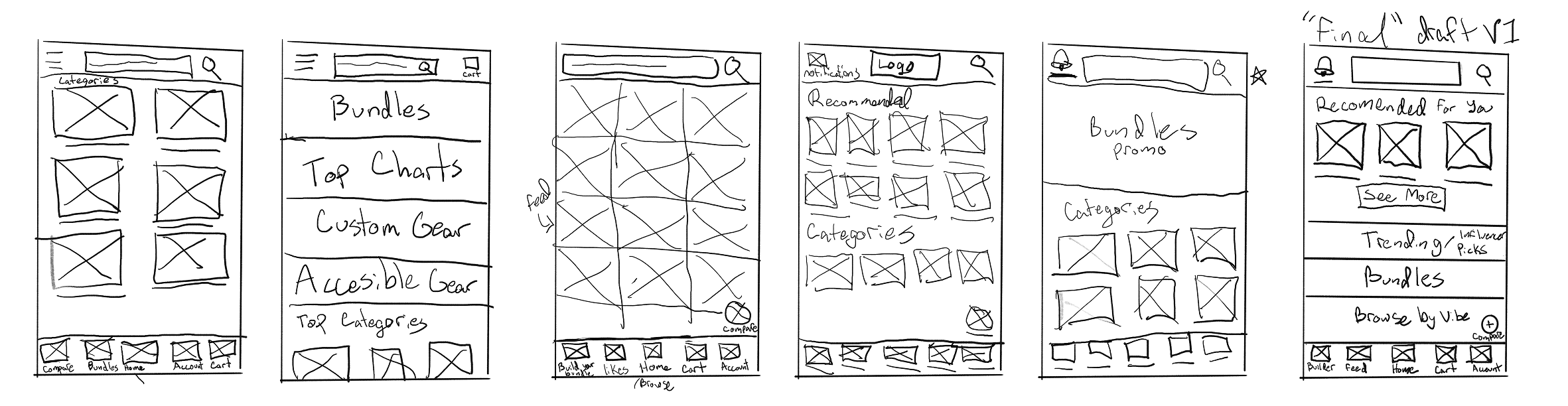
View more paper wireframes in Figma.
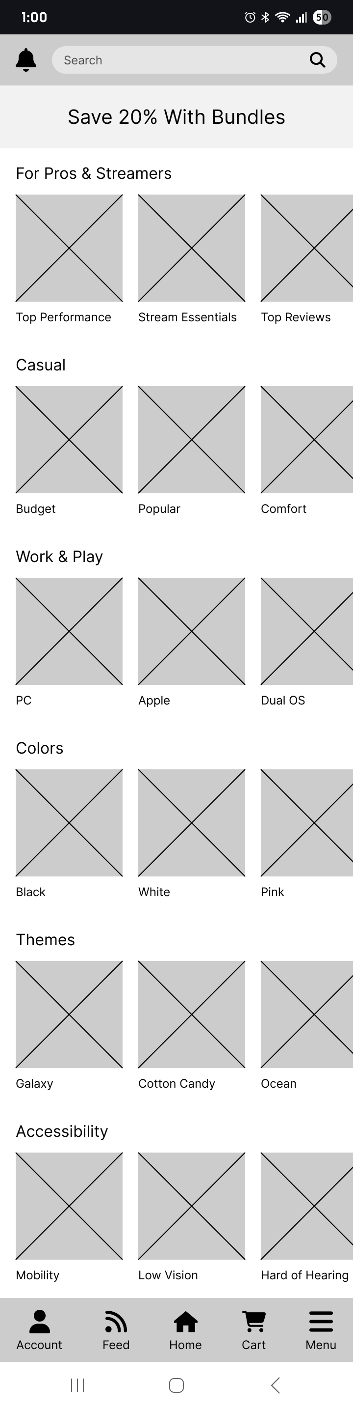
The lo-fi prototype (Figma) includes 3 main user flows: browsing and filtering for individual products, bundle customization, and browsing categories such as themes or accessibility products.
I conducted a usability testing using a survey. Overall the first draft was received well with only a couple adjustments.
Research Findings:
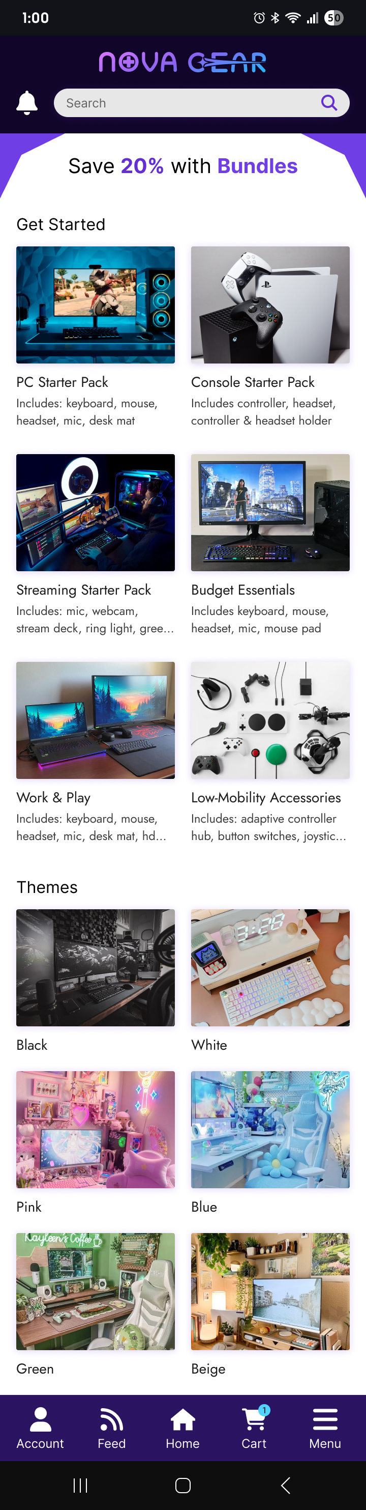
The hi-fi prototype (Figma) includes some adjustments based on the usability studies & an added checkout process. I found that some of my wording in my prior usability study may have been a bit confusing, so I adjusted some prompts to be a bit more clear.
Research Findings:
If this were a real project, I would continue working on it until all the features are completed. For this app, it would include a social feed/ gallery, account settings, order status pages, and more product types. Next steps may include more user studies post-launch as well as brainstorming new features, such as the product customizer feature that I ended up dropping. If the scope calls for it, I would also continue with a responsive website design.
“The app is well made and has a good ease of use, very clean style, and isn’t boring to look at. The layout is nice, and I like that in the bundles there is an option to swap, as I haven't seen that be a function before.”
- Study Participant
I've gained a few more skills related to UX design that I didn't experience at my previous role. Primarily, I've learned what user research processes look like and how to go about conducting it.
